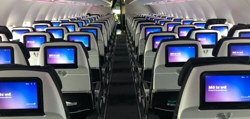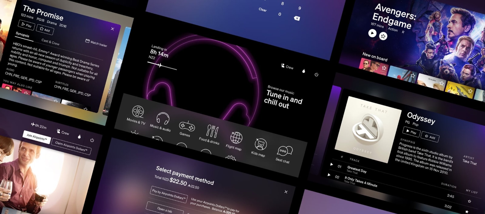
In-Flight Entertainment Project
Client
Air New Zealand
Summary
Building the next generation of in-flight entertainment system for Air New Zealand.
Despite numerous constraints and challenges, the project was a huge success with customers.
Related Work
Roles
Technical Lead
Technical Designer
Team sizes
8 people in New Zealand
12 people in California
Status
Ongoing
01 // Overview
Air New Zealand started this project in partnership with Panasonic Aviation to replace the software in its existing Panasonic IFE (In-Flight Entertainment) system.
Whilst the existing system was already world renowned for being best in it’s class, the experience and interaction design was begining to look and feel dated.
The goal was to create a modern, fast and fluid, customer experience that followed our new branding and would last the next 5 to 8 years.
02 // Problem Space
18 months into the project it was both overdue and not in a state that could be put in front of customers.
The system was unresponsive and slow with frequent freezes, causing motion sickness in customers while the plane was still on the ground.
There were hundreds of bugs and issues on the backlog and they were steadily increasing as development progressed.
Our design system and branding were inconsistently implemented, rather than feeling like a next generation experience it felt unpolished and incomplete.
The relationship between Air New Zealand and Panasonic had become tense and not conducive to creating the best work from either side. The entire project was on the verge of being scrapped in favour of simply re-theming the existing system to current brand guidelines.
03 // Mandate
I was brought into the project as technical lead alongside a new design lead Asher Pilbrow. Our mandate was threefold;
- Re-establish positive working relationships between Air New Zealand and Panasonic Aviation.
- Get the project up to Air New Zealand’s customer experience and design standards.
- Get the system stable and the backlog of bugs and issues consistently decreasing over time.
04 // Challenges
The only place to view and review the system was on racks of test hardware and equipment at Panasonic Aviation in Lake Forest in Califonia. In addition to being a 4 hour timezone difference to New Zealand, it was also a 13 hour flight + 2 hour drive away.
Anything installed in an aircraft goes through a rigourous and expensive safety certification process, and thus ends up flying for 8 to 10 years. Whilst some of the IFE hardware was only a couple of years old, the majority of the installed hardware was already 7 years old.
Due to NDAs and contracts no one from Air New Zealand could directly work on, or even see, the code for the project.
Most of the original Air New Zealand project team had moved on to other projects.

05 // Discovery
We spent the first five weeks on the project in discovery, working out where we were and how we got there. The key issues we identified were;
-
Our design mockups were intended to be used in conjunction with documentation to communicate general intent. Unfortunately we had not communicated this to the development team who were treating them as pixel-perfect reference designs.
-
Our in-house design system concept of standardised re-usable components were not communicated to the development team. Combined with the above issue, the result was inconsistent implementations of typography, spacing, layout, buttons, labels, titles, movie and audio items.
-
Our designs used blur effects as a key element to indicate depth and information hierachy. Experimentation and performance analysis revealed that none of our seatback screen hardware was powerful enough to do these in real-time as the designs required.
-
Panasonic and Air New Zealand were working to different definitions of done, particularly in the areas of performance and visual fidelity. Features that Panasonic Aviation considered complete were often considered unacceptable by Air New Zealand.

06 // Process
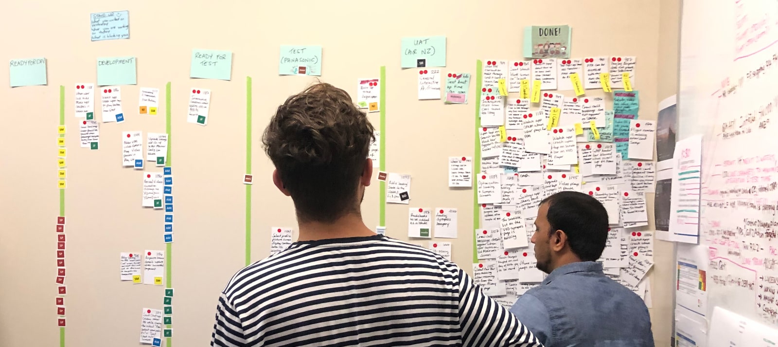
The product owner, the new design lead Asher Pilbrow, and myself flew to California to meet the Panasonic team.
Working together across the teams we established shared goals and definitions, particularly in the areas of performance and visual fidelity.
As part of this work we established more open and flexible ways of working that bridged the different cultures between the teams. The Panasonic development and QA teams were used to very hierachical relationships with their partners and this took a lot of undoing.
These new ways of working became one of the cornerstones that enabled the project to be successful.
Redesign
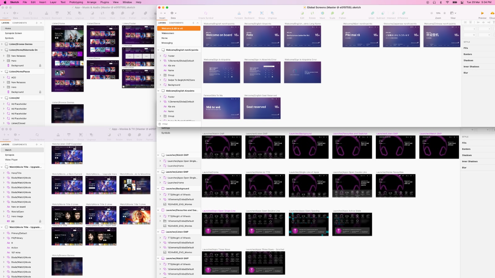
Asher and I collaborated to modify our designs based on the CPU + GPU capabilities of the seatback hardware so that they were performant whlilst still conveying the intent of the original designs.
Asher rebuilt all our screen designs with these new modifications as pixel-perfect reference designs that also followed our design system. He then worked alongside the development and QA teams to make several hundred pixel level tweaks across the entire system to align the system to these new reference designs.
Part of this work was also ensuring sizing of labels, buttons, and text fields would correctly support localisation with more verbose languages.
Redevelop
The Panasonic Aviation development lead and I collaborated to create re-usable implementations of our design system elements (buttons, titles, labels, spacings, margins, various on screen controls) so they would appear consistently throughout the system.
We also identified key interactions and transitions that needed performance attention, and worked to tweak existing implementations or create performant alternatives. The details of this extensive work are covered here.
This work was complicated by our contract and NDAs forbidding the Air New Zealand team from seeing or working on code directly. Instead we talked through the current implementation, discussed alternative approaches and optimisations, then reviewed the performance of the new implementation together. We iterated in this way for months.
07 // Output
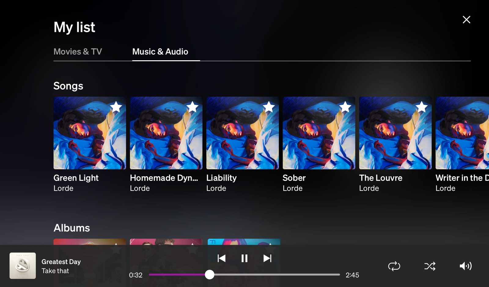
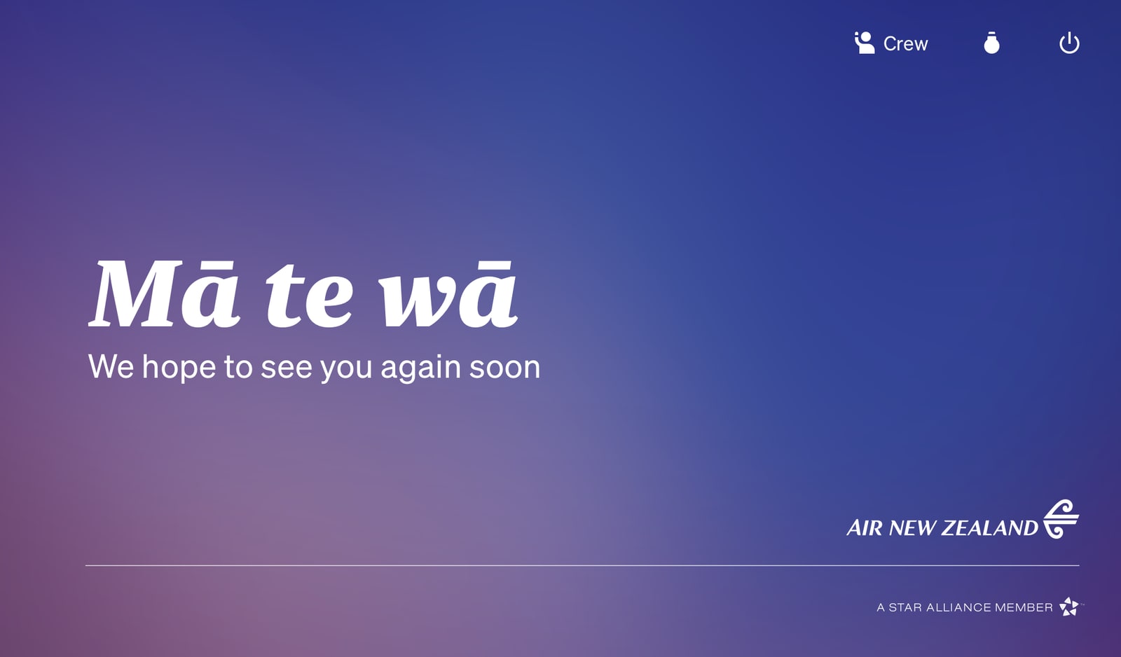
As a two continent team we’ve delivered a new, modern and performant customer experience that we’re now proudly rolling out to our entire fleet.
- Clean, consistent, and modern design and user experience
- No touch left behind - system responds to input in an immediate and visible way everywhere
- Beautiful transition animations to spatially guide customers and help mask slow transitions
- Interaction performance is consistently 50 to 60 frames per second, even on 8 year old hardware
- System stability is dramatically higher than the previous system, which was already an industry leader
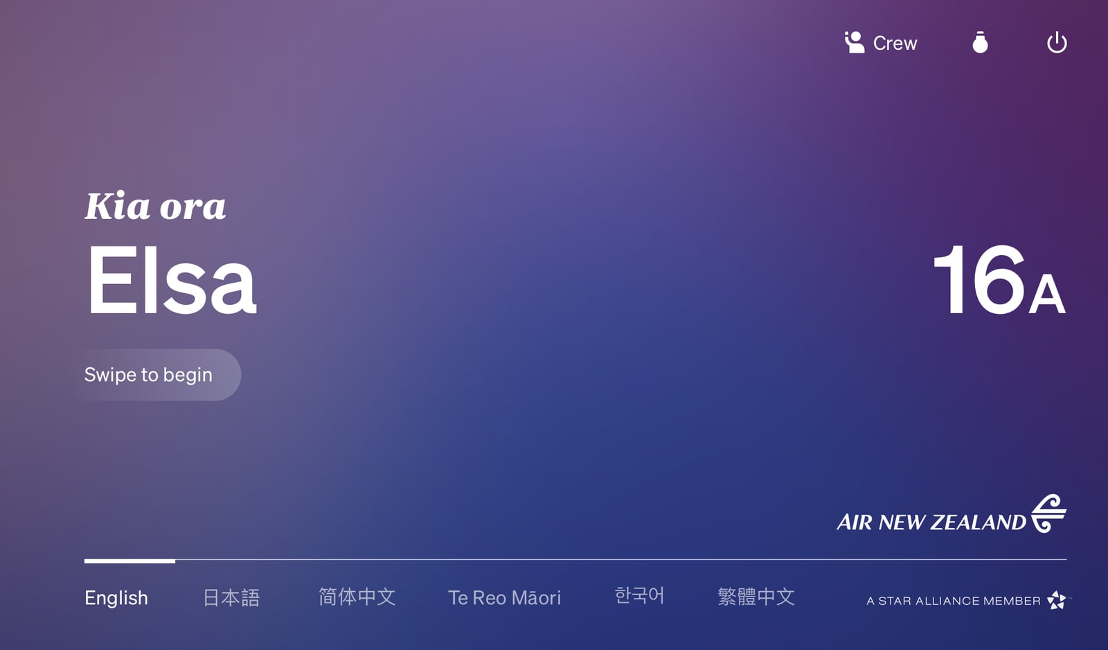
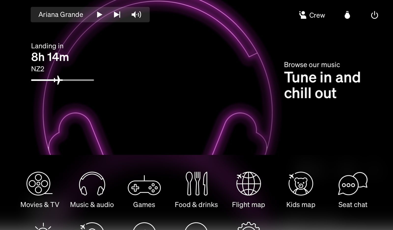
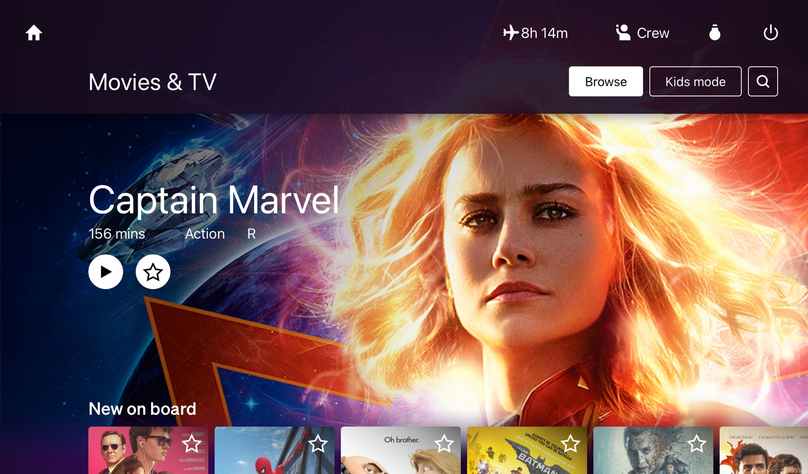
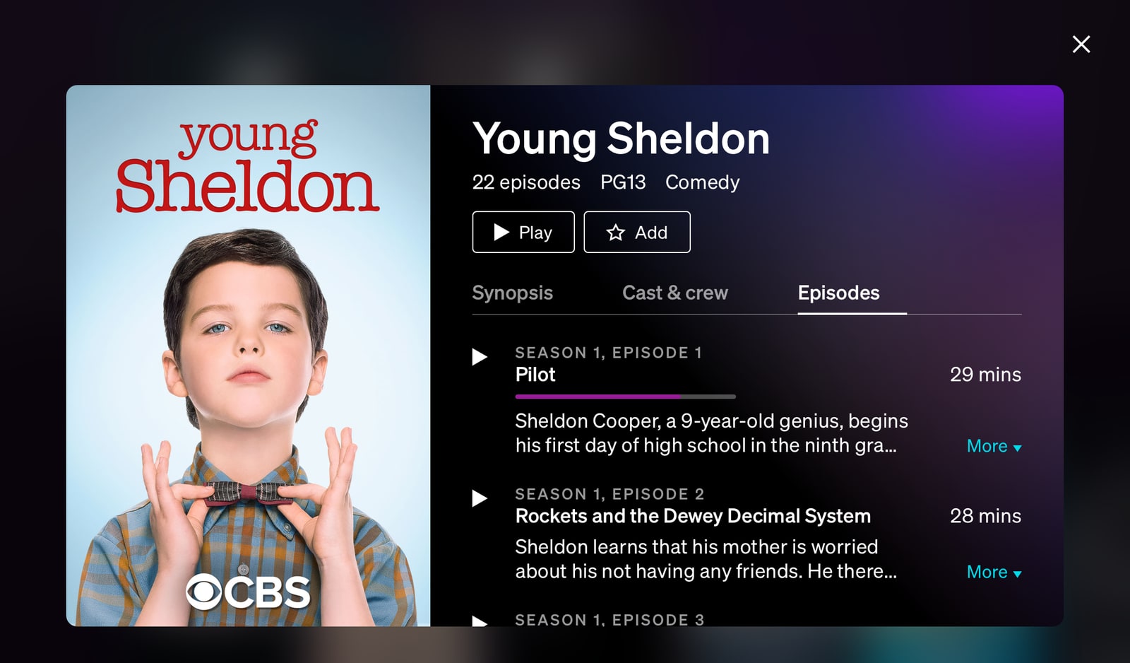
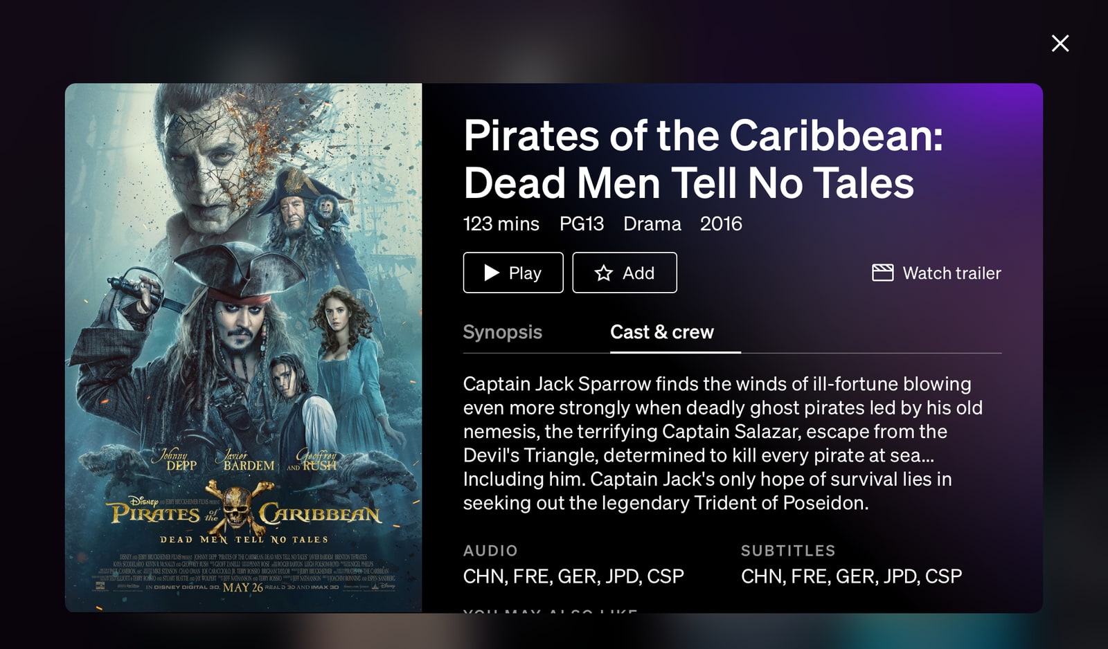
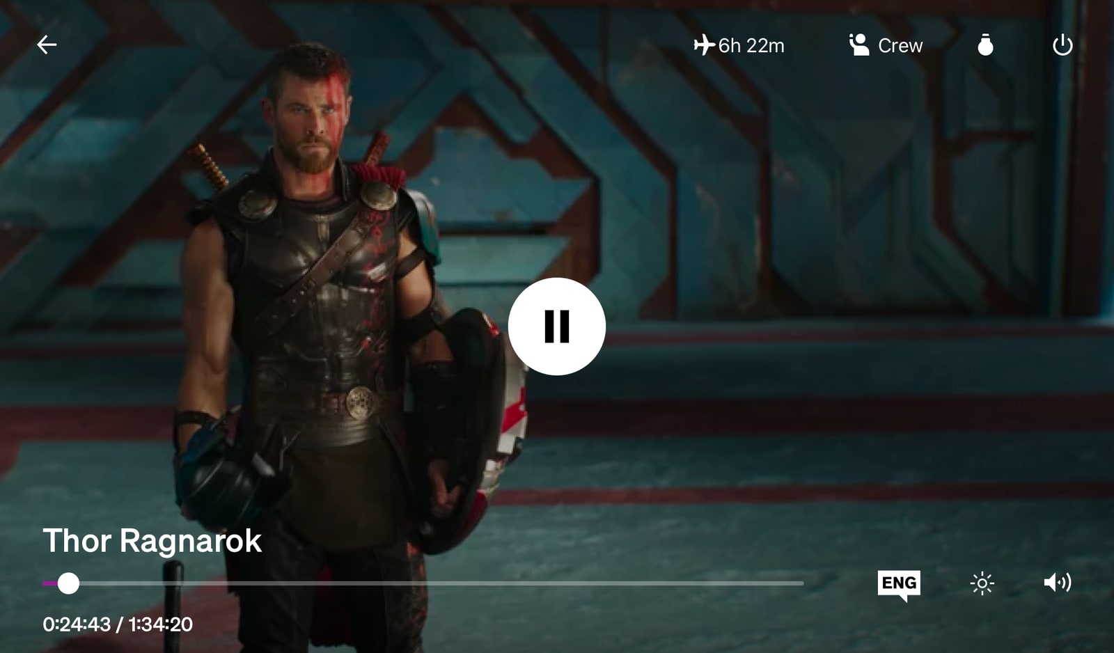
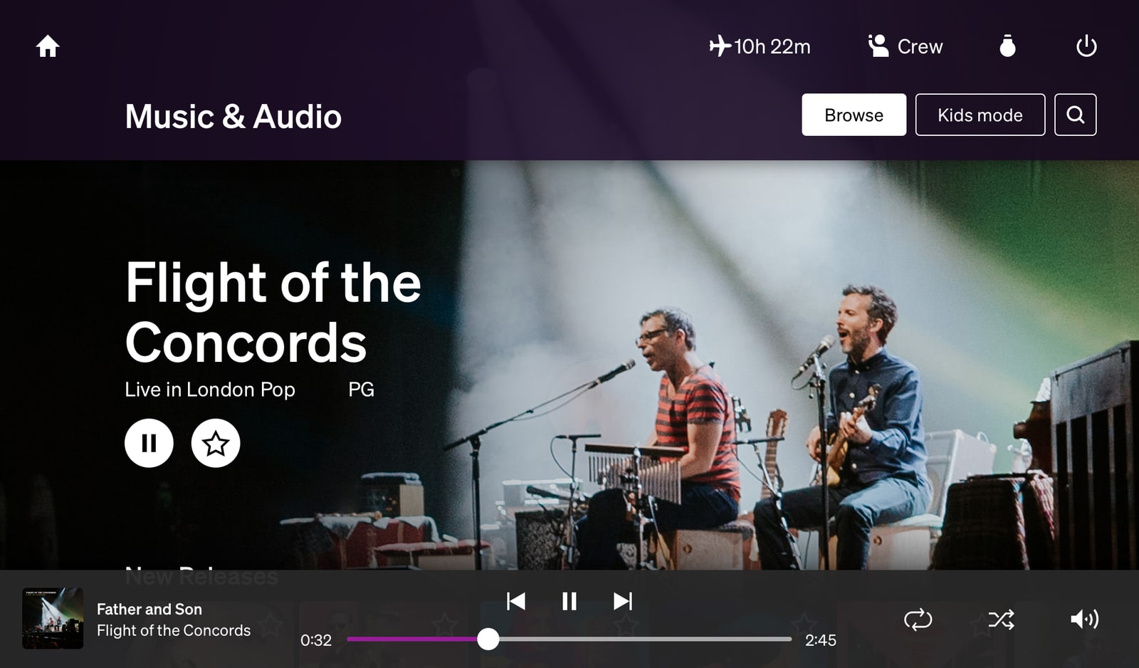
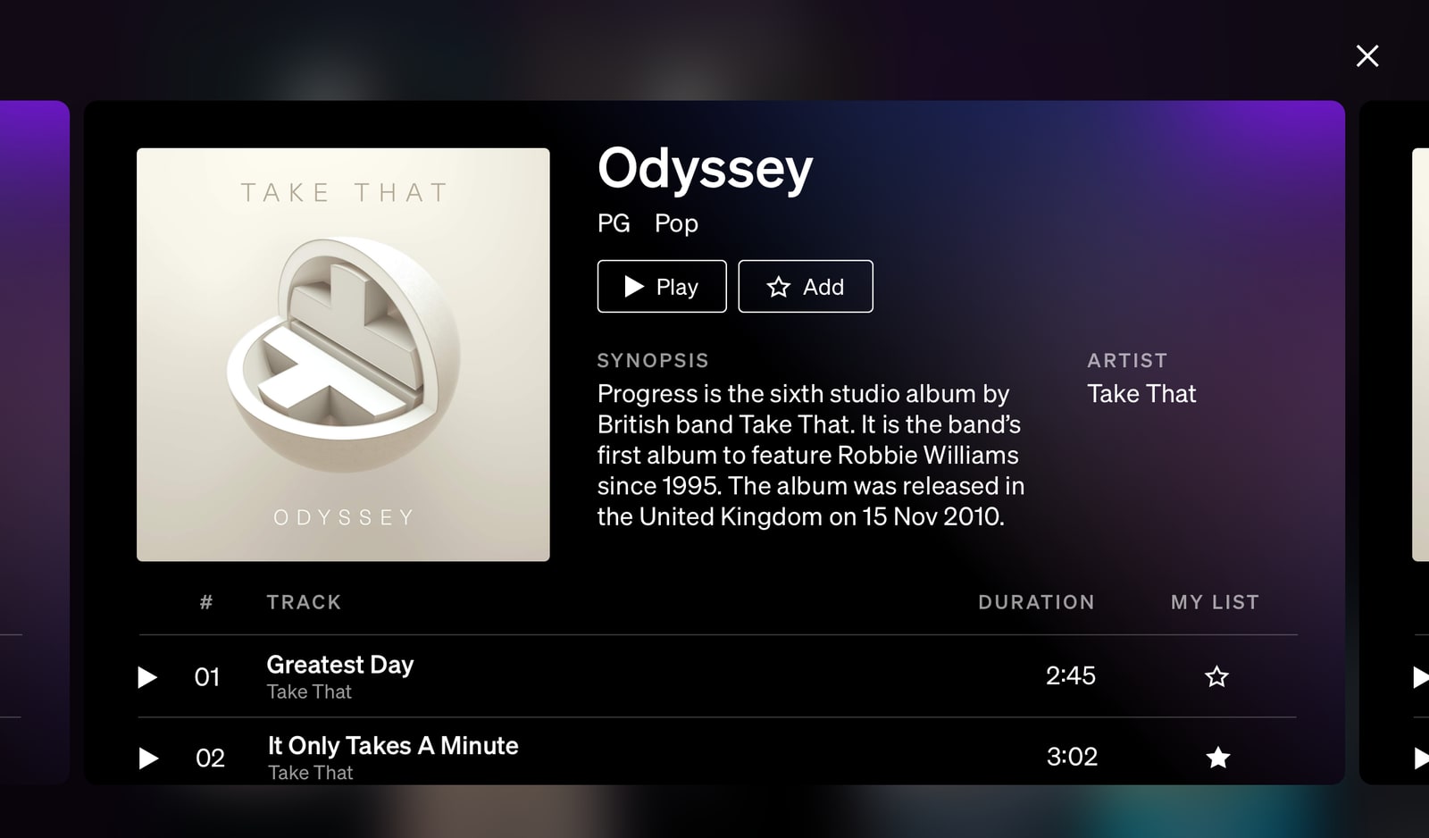
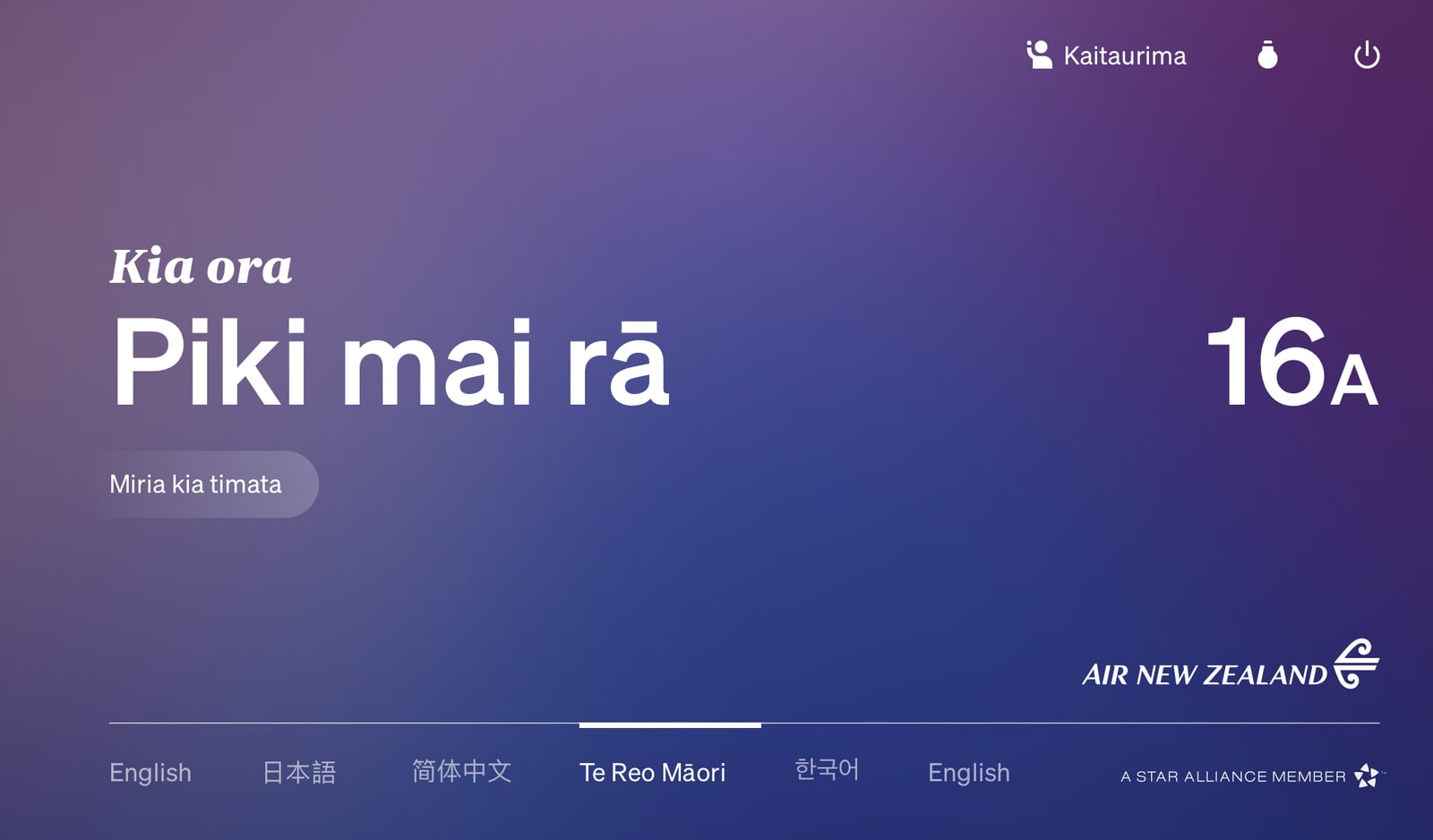
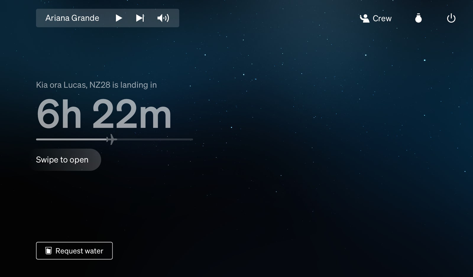
I’m particularly proud of the following features we added (and protected from being de-scoped) during this time:
- Te Reo Māori language support across the entire system
- New wake up screen feature, complete with shooting stars
08 // Coda
This has been one of the most challenging and rewarding projects of my career.
The feedback we’ve had from customers on this project has been positive and often extraordinary. My personal favourite was hearing Adam Savage of Mythbusters and Tested.com rave about it on his podcast, as a fellow maker this shout out was particularly gratifying.
