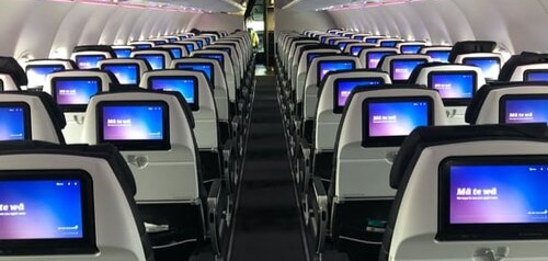
In-Flight Entertainment Performance
Client
Air New Zealand
Summary
By working on visible and measurable performance issues, we were able to uncover and address otherwise invisible technical debt.
Customers loved the results, and we had more stable code with less bugs that was easier to maintain and faster to test.
Related Work
Roles
Technical Lead
Technical Designer
Team sizes
8 people in New Zealand
12 people in California
Status
Ongoing
01 // Overview
Performance is usually the first thing that’s abandoned in software projects as deadlines loom. Yet performance work has non-obvious benefits that go far beyond customer satisfaction.
There is often a strong correlation between problematic performance and technical debt. By deliberately conflating the two we can often use work on visible and measurable performance issues to tackle invisible technical debt.
On this project each time we fixed a performance issue, it revealed another performance area to address. Improved code was put into reusable libraries and thoroughly tested. As it was integrated throughout the project we were able to remove existing, often duplicated and buggy, code.
This performance work made the system dramatically more responsive, but it also became more stable, more consistent, had less bugs, was easier to maintain, and faster to test.
These benefits saved this project from being scrapped.
02 // Performance
Performance solutions are often a case of less is more, of getting the same effect more efficiently.
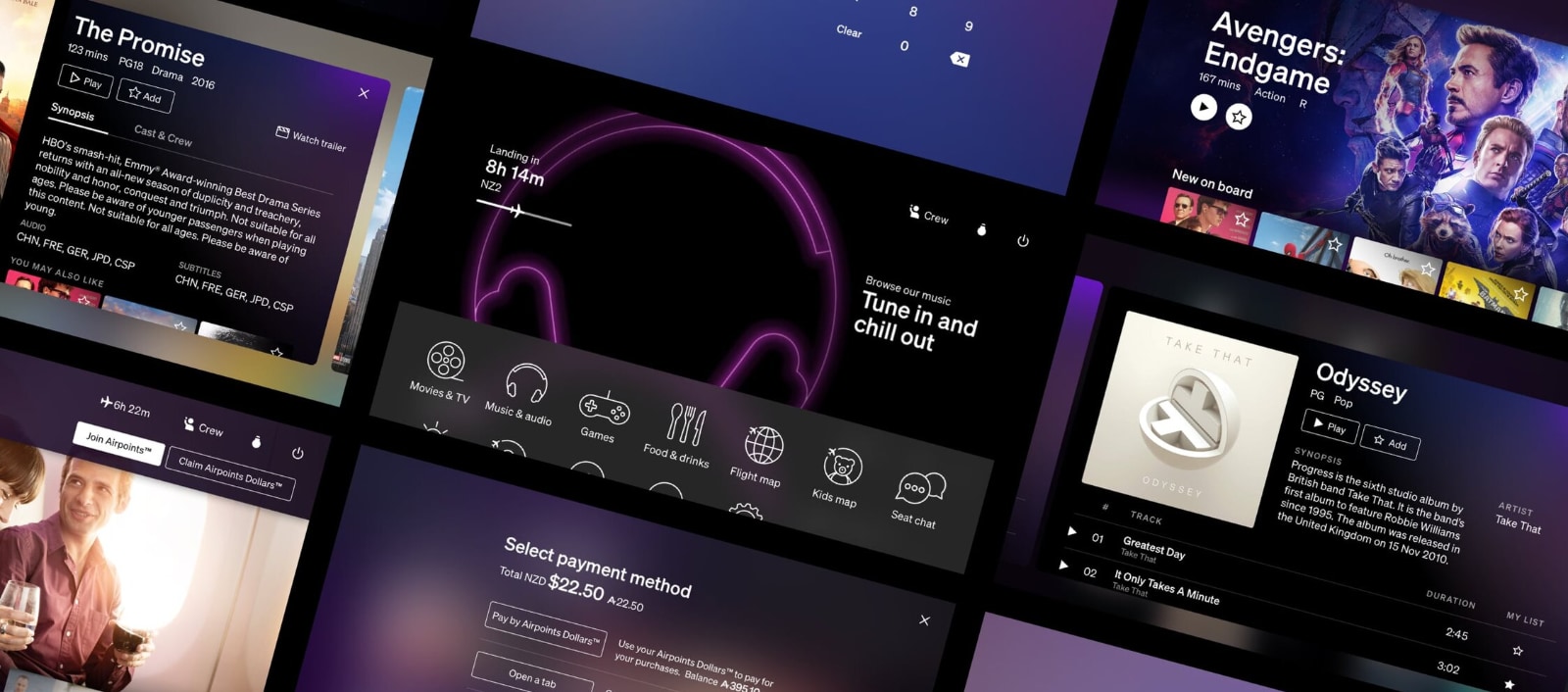
Background Blurs
Our designs use a blurred version of the parent screen as the background image on child screens to visually connect them and show their relationship and hierachy.
The GPU in the seatback displays wasn’t capable of blur effects so they were done on the CPU. The system standard way of creating this blur took 2 seconds to render on the seatback screen hardware. During this render time the screen was effectively frozen and couldn’t be interacted with.
We replaced this with a faster, but less visually accurate, way of doing blurs from my demoscene days. Combined with overlaying a simple darkening effect gave us largely the same visual result as the original design but twenty times faster.
Blur Animations
Our design uses an animated transition where the content on the screen increasingly blurs and dims as modal screens and menus appear over them.
The original approach attempted to calculate the blur of the entire screen hundreds of times during the animation. Not only was the seatback screen unable to keep up which caused visual stuttering, the system was completely unresponsive for the duration of the animation.
Knowing that the GPU hardware could do simpler transforms like opacity changes I designed a new approach. Now we render a single blurred image of the current screen (using our new fast background blur code) into an invisible layer over the top of the entire screen, then we animate the opacity of this new layer to become visible and oclude the underlying content.
The result looks almost indistinguishable from the original animation, but now runs at 60FPS and doesn’t block interactions.
Hero Images
The landing screen in our most used apps (Movies and TV, Music, Food and Beverage) have large “hero” images with bold coloured gradient backgrounds behind them.
Unfortunately scrolling dropped to under 10FPS when they were on screen. Even worse they appear onscreen on first run of the apps giving customers a bad first impression.
Investigation traced the performance issues to the hero image requiring transparency and alpha blending with it’s background. The size of the image blending (it covers 70% of the screen area) overwhelmed the GPU.
I designed a new approach which removed all alpha blending and transparency. Working with the designers we created a new horizontal background gradient for the screens. A new hero image Photoshop template was created and distributed to the content team which pre-rendered the gradient and hero image into a single layer, the bottom edge of which blended perfectly with the new horizontal background gradient.
The result is an invisible overlap of the edge of the hero image and the background, for a result which looks indistinguisable from the original but now animates at 60FPS.


Media Pipelines
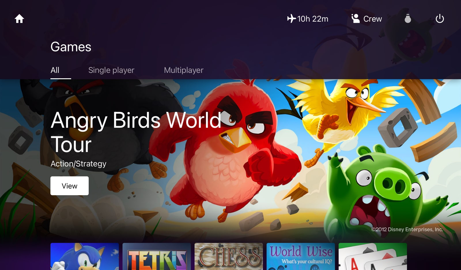
Scrollable lists of items with images (Movies and TV, Music, Food and Beverage) were slow and unresponsive, with visible pop-in as images loaded well after they appeared on screen.
Investigation revealed the media images were being generated at a single size for all screen types and at a much higher resolution than required. The scroll view had to do real-time resizing for all images, which caused the sluggish scrolling. The larger images were slower to load from disk and less of them could be cached in memory at one time causing them to be repeatedly unloaded and reloaded, which caused the visible pop-in.
Working with the media team we created different content generation pipelines that created correctly sized and compressed images for the screen resolutions for each aircraft and cabin class.
The result was no real-time resizing, the smaller images load faster, and more can be cached in memory - which gave us the desired faster scrolling and a massive reduction in image pop-in.
Language vs Layout
To support multiple localisations and languages, the Panasonic team had ported a complex system from their previous Linux/QT based IFE system. This worked by dynamically changing fonts based on the current selected language.
Unfortunately this was messing with our layouts differently for each of the 6 languages we supported, creating a nightmare of hard-coded pixel adjustments per language in our screen code. It also completely blocked us from using the Air New Zealand brand font in key languages (Korean, Japanese, Chinese).
Working up the Panasonic organisational hierachy I convinced the projects lead developer, then the IFE technical lead, then the platform lead at Panasonic to use the built-in Android font fallback system instead.
The result was thousands of lines of unnecessary code removed, the hard-coded pixel adjustments were removed, and we were able to use the Air New Zealand brand font across all languages.
Bonus results included layout performance improvements and nearly two hundred layout bugs in the backlog were fixed instantly.
02 // Compromise
Despite addressing the key issues above, we still had parts of our design that were causing significant performance issues.
I collaborated with the lead designer to update our design to address the performance issues whilst keeping the original intent of them intact.
Animated Transitions
Our original design called for transitions between the home screen and applications to have multiple elements with motion, blur, zoom, and distortion effects. Unfortunately they overwhelmed the GPU causing stuttering and slow transitions.
Working with the lead designer I simplified the animation requirements to use only the transforms the seatback GPU could accelerate (zoom, translation, opacity). Then I worked with the lead developer to design a new approach to render all elements to a single layer for better performance.
The result has the visual intent of the original design, but now runs at 60FPS and doesn’t block interactions.
Navigation Headings
Our original design had header bars at the top of most screens with backgrounds that were a translucent blurred version of the content behind.
Despite trying multiple different approaches this caused too much work for the GPU, resulting in halving scrolling speeds and making all other animations and interactions drop frames.
We replaced the real-time blur effect with a simple translucent panel tinted to the IFE brand color. This was the biggest visual concession the designers had to make.
The result keeps some of the intent of the original, but now runs at 60FPS making it a classic trade-off between performance and visual fidelity.
03 // Smoke & mirrors
Where we can’t speed things up, we distract you like a magic act so you don’t notice the slow.
Transitions
In the core apps (Movies and TV, Music, Food and Beverage) going from an items poster to it’s detail screen made the system freeze for 2 to 3 seconds, then the detail screen appears instantly and without animation.
Investigation revealed that for a variety of reasons a lot happens in the system during in this transition, too much to successfully animate at the same time.
Instead I designed a new approach that broke the transition into a sequence:
- Blur the current screen
- Display the detail screen with empty fields over the blur
- Load the data and images into the detail screen
- Load the previous and next items, and animate their detail screens into the edges of the screen
The end result is actually slightly slower than before, but perceptually it feels much faster because it responds instantly and displays progressive visual feedback.
A bonus result was the addition of the previous and next items sliding into view increased the discoverability of being able to horizontally scroll between items.
App Launching
Launching apps had become slower over the duration of the project, until it reached 2 seconds for the icon on the home screen to visually confirm it had been tapped, and an additional 2 to 5 seconds to switch to the selected app.
Investigation revealed that logging and other housekeeping tasks had grown throughout the development and now added up to significant delays. Working with the lead developer we moved some of these tasks into a low priority background thread and distributed the rest to other system event hooks.
This work dropped the overall app launching speed to a consistent 1.8 seconds, but there was still an unacceptable delay to visually confirm respond to your touch causing people to tap repeatedly in frustration.
I repurposed existing accessibility code that outlined the current icon to instantly confirm your touch and then start the switching process. Whilst this slightly slowed the switching process, the customer perception is that it was now significantly faster.
Search
Search results in the Movies and TV or Music apps were taking between 10 and 15 seconds to show any results, during this time the system was unresponsive to all interactions.
Investigation revealed there were multiple searches happening sequentially, and the system was waiting for all the results to come back before displaying anything. For instance in the Audio app we searched: album name -> artist name -> song title.
We redesigned the search to work on a background thread so it never blocked customer interactions, and to display result sets as each search type returned.
Customer testing further revealed the search order should be changed to: artist name -> album name -> song title. In a happy coincidence this was also fastest to slowest in search times as each data set was bigger than the last.
The result is that all searches now show first results in under a second and can be acted upon immediately without having to wait for all searches to finish.
Volume Control
Both the onscreen volume controls and the hardware volume buttons on the seatback screen were slow to respond. They also aggregated multiple adjustments together which caused large jumps in volume, which resulted in unpleasantly surprised customers throwing their headphones from their heads.
Investigation revealed there is a delay between the hardware changing the volume setting and the system being able to read the new value. The existing approach waited to confirm the changed values before applying the new ones, and it aggregated input while it waited.
I worked with the development team on an updated approach where onscreen and hardware volume buttons take effect instantly without any input aggregation.
Whilst this meant the onscreen visualisation of the volume lagged behind the audible levels, customer testing confirmed the system felt more responsive and resulted in the elimination of headphone throwing in the cabin.
04 // Summary
At the end of the “performance and visual polish phase” of this project we had a system that’s:
- Fast and Fluid
- Responsive to Interactions
- Visually Consistent and On Brand
- Extremely Stable
Due to the hard deadlines of aircraft arriving on specific dates, initially we had to go live with the unoptimised versions of this system. This gave us the unique opportunity to measure CSAT (Customer Satisfaction Scores) before and after this performance tuning phase.
Whilst our scores were was already okay due to the large selection of content on the system, CSAT went from mid 60’s to mid 90’s with no other changes.
Performance and polish matter to your customers.

05 // Thanks
Thanks to Asher Pilbrow for being my co-conspirator on this project, always ready to collaborate and evolve designs to get results.
Thanks to the Digital GMs at Air New Zealand for supporting extending the project as “the right thing for our customers”.
Huge thanks to the Panasonic Aviation team for allowing us to drive them this hard for well over a year to get the system fast and polished. You’ve put us back in front of our competitors, again.
Apologies to the 4 delivery leads, 3 product owners, 2 account managers this project crushed during it’s three years of active development.